Thursday, May 17, 2012

Do Cthulhus Dream of Protoplasmic Sheep?


When you’re a small time comic book artist like me, you treasure any collaborator who is creative, open to suggestions, and pays you on time.

I know a few terrific guys like that, and one of them is the very talented Mr. Phil McClorey.

The stunning cover of Phil McClorey's
new Horror in the West anthology, painted
by the talented Tony Taylor

 In my bizarre little life things often take on a surreal quality, and I usually have a good story about the weird ways in which I’ve met some of my friends. Like the great Ian Williams for instance.

When we were both animation students at Sheridan College, I left my car lights on one morning and returned later that day to a dead battery. Of the few remaining students still there, Ian was the only one with a car. He kindly gave me a jump-start, I thanked him profusely, and we went our separate ways… Until I did the same damn thing the very next day! Ian, in his unique, existential wisdom, decided the universe was shoving us together and that we should be friends. That was quite a leap of faith considering I must have appeared to be a scatterbrained moron, but he was right, of course, and we became very good buddies.

Unfortunately, I don’t have a cute story like that for Phil McClorey.

In fact, I really don’t recall exactly how we met. It may have been at a convention, or he may have gotten my name via the grapevine when looking for artists, I honestly don’t recall.

See, Phil’s not a loud, gregarious, annoying type of person, like me.

He’s just this nice, soft-spoken, unassuming guy who happens to craft creepy horror stories of the most gruesome and disturbing kind. Phil and I have collaborated on a few choice examples of his unnerving little yarns, and I’m still having nightmares.

You can check out those stories, Portal of Its Eye and URL Dead, and many other great tales of terror here: http://www.furiouscomics.com/


From "Under the Mountain" Story by Phil McClorey,
art by Jeff McComsey and Jason Copland

Now we come to the reason for this post and the strange dream that led to my inclusion. One evening about a year or so ago, I had one of my typical weirdo nightmares. I saw it as a little movie, playing out before me, like I was the camera rather than a character in the story. (I’m sure any good psychologist would consider the fact I didn’t star in my own dream to be proof of incipient insanity… and who am I to disagree?)

In the dream, I saw this cowboy, in classic Wild West gear, sitting stoically on his horse in the cold drizzle, dutifully watching over his herd. Only, it wasn’t a herd of sheep or cattle. It was something far stranger… and more tentacled…

As usual, I woke up and jotted down the weirdness for future reference.

Less than 48 hours later, I got an E-mail from Phil, telling me he was putting together an anthology of Western-themed horror stories. Freaky, right? I immediately remembered good old Ian Williams and his thoughts on how the universe pushes people together for a greater purpose. It certainly seemed like something cosmic was up that day, though one had to wonder at what arcane powers were behind that little coincidence.

A tense moment from "Brother's Keeper"
story by AG Pasquella, art by Brian Evinou

So, I drew up the story, Star Calf by name, and Phil included it in his new anthology Horror in the West.

And now that anthology needs some funding to be published. Please check out the Indiegogo fundraiser site here: http://www.indiegogo.com/Horror-in-the-West

And, if you can, drop a few bucks in the kitty, (In exchange for some great perks!) and help foal this eerie little tome out into the world.

As for you, Phil McClorey, thanks for counting me in on this little adventure. “Cthulhu R’lyeh!

Panels from "Star Calf" story and art
by Sam Agro (That's me!)


Sunday, May 6, 2012

My Top Ten Comic Runs of All Time


The World According to Sam

A few caveats:

Since I’m as old as dinosaur crap, some of this is pretty ancient stuff.

It’s a little Marvel-heavy since for years I followed almost nothing from DC except the Batman and Kirby titles.

And, I got a little carried away with my justifications and they turned into mini-dissertations.

Also, there’s WAY more than 10. (Hey, it’s my list, I’ll make it as long as I want!)

I’m not going to attempt to rank them, I just offer them up as truly great runs.

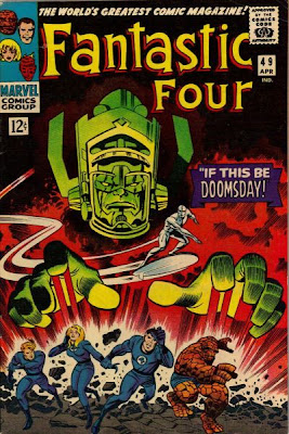
Lee and Kirby’s Fantastic Four
This was pretty good, right out of the gate, but I’m thinking especially of the issues starting right around #47, when Joe Sinnott takes over the regular inking chores, right up until Kirby’s departure from Marvel with issue 102. Sinnott starts inking just around the same time Kirby begins to open up his layouts and really go bananas. In my opinion, Joe was the best artist that ever inked Kirby. There are others who inked Jack’s pencils more faithfully, but I think the minor degree of refinement Joe adds is just right.


Nobody ever did giant, cosmic threats from beyond space and time, or balls-out, killer action better than Kirby did then, (or ever). And no one ever thought of so many great characters and ideas in rapid sequence as Stan and Jack did with the Fantastic Four. Galactus, Blastarr, Doc Doom, The Silver Surfer, Black Panther, The Inhumans, The Negative Zone, and on and on and on… Stan’s scripting, which often felt a little too overblown on some of the more down-to-earth titles, (like Daredevil, say), was perfectly matched to the titanic galactic imagery of Jack’s FF.

I’m not going to revisit the debate over who created what here. It will forever be an unknowable truth. All I do know is that the team of Stan and Jack together built something greater than either of them ever did on their own, or with other collaborators.

This is a brilliant and very long run of superior comics.

Who else but Jack 'King' Kirby?

Joss Whedon and John Cassiday’s Astonishing X-men
While I don’t love all the choices Whedon makes with the storietelling here, he certainly knows how to write a scene that keeps you reading. His stories are compelling and he doesn’t skimp on the action. He weaves a fairly interesting tale, and his characterization is top notch. He also returned Kitty Pryde to the lineup, which pleased me enormously.

However, the real story here is Cassiday’s art. Of all the guys who do the “wide screen” style of comics storytelling, (no panels taller than they are wide) he does it best. While Bryan Hitch is certainly effective in that style, his heavily photo-traced approach, while impressive, always leaves me a bit cold. Cassiday on the other hand still delivers a sense of the drawing being pulled from the artist’s imagination. His art is solid, strong and expressive, and has an appealing simplicity, while still being anatomically believable. But it’s the continuity I like best. It’s bold, straightforward and flawlessly paced.

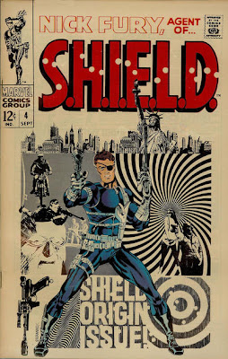
Jim Steranko’s Nick Fury Agent of Shield
This isn’t a long run but it’s pretty amazing. Especially the Who is Scorpio storyline. It was at this point Jim stepped beyond merely aping the Marvel-style Kirby dynamism, and began to add in his own cinematic, and modern-art influenced innovations. It’s a bit more about the art than the writing, but the stories are certainly fun and solid. His experiments in pacing and page layout, and color use, utilizing it for its psychological and visual impact, were progressive. This included the judicious use of limited color and black and white panels. He also does the first 4-page gatefold ever done in the comics. At the time, these comics were truly mind blowing.

Pop art sensibilities nicely
wrangled into comics fun
by the innovative Jim Steranko

If you throw in the few amazing issues of Captain America he did around the same time, and give a nod to a couple of the things Neal Adams was doing, this is really the creative hinge between the Silver Age, and whatever you want to call the next wave of guys who came in. Guys like Wrightson, Jones, Kaluta, Gulacy, Windsor-Smith, Corben, Byrne, Zeck etc, etc.

This is VERY influential stuff.

Startling use of colour
from Jim Steranko

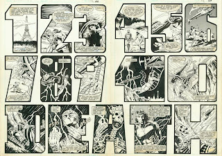
Doug Moench, Paul Gulacy, Mike Zeck and Gene Day’s Master of Kung-Fu
A few other artists crop up here and there in this astounding run of comics, (Including Toronto’s Jim Craig!) but these three artists all do absolutely fantastic, long chunks of this run. With a solid overall continuity supplied by Doug Moench, the book takes the chop socky movie genre and successfully marries it with the James Bond spy trend in this globe-trotting adventure. It’s all perfectly spiced with the unresolved father-son issues of Shang Chi and his crazy, world domination bent father, Fu Manchu. There’s some nice spicy romance in there too.

A unique layout from Gene Day

Gulacy fully absorbs the inventive storytelling lessons of Steranko and really digs into his rendering and choreography. He hits his stride nicely here. Zeck follows up by injecting a little Buscema-esque layout technique into the storytelling, and quickly sorts out his unique graphic style.

Another amazing page from Mr. Day

But the most interesting, and saddest story, is Gene Day’s. Beginning as the inker for Zeck, he improves at an astounding rate, and eventually takes over penciling AND inking the book. He re-incorporates the Steranko-Gulacy storytelling style and adds a few cool touches of his own.

I don’t know if you guys have seen his stuff, but there are a few issues that are truly incredible. Sadly, he doesn’t get to do nearly enough before his heart explodes from a bad diet, a crushing work schedule, and zero exercise. I truly believe he would have become one of the great modern masters had he lived. Unfortunately, his early death has left him largely forgotten.
An utterly astounding use of panel to panel flow
in this incredible 2-page spread by Gene Day


For those who may be interested, there's a nice little bio-appreciation of Gene Day, written by Dave Olbrich here:


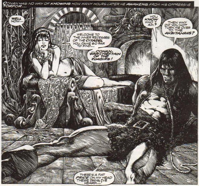
Roy Thomas and John Buscema’s Savage Sword of Conan
I especially love the stories inked by Alfredo Alcala. I chose this series over Roy and John’s run on the color Conan comic for several reasons. First, the larger format and larger originals gave John a bit of room to breathe in the layouts. They are frequently much more interesting than what he was doing on the regular comic. Also, the spicier and more adult parameters of the black and white line allowed them to better capture the spirit of the original REH stories. And, to me at least, the black and white art feels somehow more “right” to present the adventures of Conan. There was no color in the Hyborian age! It was dark and gritty and grey.

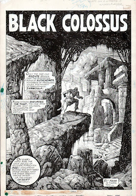
Buscema and Alcala make us truly
feel the ancient world of Conan.

No inker captures the crusty and shiny textures of this lost time better than Afredo Alcala. His baroque rendering perfectly evokes a sense of time and place. Buscema is rumoured to have disliked Alfedo’s inks, which he claimed were overdone, but more likely he just felt they overpowered his pencils. However, in my opinion, John’s layouts are powerful enough to be utterly unmistakable even under the frenzied rendering of Alcala’s inks. Tony DeZuniga and Pablo Marcos also do some great inking on the series.


The books get a little weaker later on, but there are about 30 really great issues. Eventually, Roy runs out of REH stories to adapt, and John gets a little “conaned out” from doing both books. Also, Tony DeZuniga, who eventually becomes the regular inker, gets a bit sketchier after embellishing some outstanding issues in the early part of the run.

A lovely cover by Boris

Also the covers were often very awesome. Early issues by Boris Vallejo and later ones by Earl Norem are just marvellous, amongst others.

Jack Kirby’s Kamandi
Okay, a word of explanation. As far as Kirby’s DC tenure goes, I have to admit, that the Fourth World stuff is more in keeping with the creative, explosive, cosmic stuff Kirby did so well. And I do think the New Gods was an amazing effort.


However, the truncated nature of the story, which was always meant to be finite and reach an ultimate conclusion before cancellation cut it short, leaves one with a niggling hunger for a measured resolution. This is a desire that wasn’t really satisfied by Kirby’s later Hunger Dogs addendum. Also the Fourth world companion books Mr. Miracle and The Forever People were not great. Mr. Miracle is serviceable, but without any real spark, and the faux-hippie silliness of The Forever People is just downright laughable.

Anyway… on to Kamandi! Kirby quickly leaves his Planet of the Apes inspired beginnings behind and goes it one (or two, or three) better! He consistently turns out a really fun and unpredictable adventure series, with a few standout stories of particularly high quality. It was during this run that my “realism” prejudiced teenaged mind finally began to understand and appreciate the beauty of all things Kirby.

Denny O’Neil and Neal Adams’s Green Lantern/Green Arrow
In addition to this being some of Neal Adams’ finest, and most expressive, artwork the book has the distinction of being one of the first to effectively apply the problems of the real world to the superhero genre. It explores issues of racism, politics, drug abuse, psychosis, and religious fervor amongst others. Though Stan Lee gave the timely issue of drug use a stab a bit earlier in Spiderman, it gets a much more measured, mature and personalized treatment by O’Neil and Adams here. Plus it still has some cool intergalactic stuff thrown in to spice things up. Again, this level of realism in the writing and the art was highly influential for later comics creators.


Len Wein and Berni Wrightson’s Swamp Thing
This was Wrightson’s only tenure on a regular comic title. Even though he eventually cracked under the scheduling strain of penciling and inking an entire book in such a detailed style, it is an exceptional visual achievement. Only one issue, where other inkers were brought in to speed up production, suffers in lost quality.

The stories by Wein run the gamut from amazing to just passable, but there are several great ones. The origin issue is very solid, and has all the moving pathos that Marvel’s Man-Thing lacked. The Archane issues are terrific, and nicely set the stage for Alan Moore’s later use of the character. The Ravenwood Witches, and the Tunnel 13 issues are just great too.

Bernie's bat will always
be my personal favourite.

However, the standout for me is Swampy’s trip to Gotham and his dealings with Batman. Say what you will about Neal Adams, Gene Colan, Norm Beyfogle, Jim Lee, Dick Giordano, David Mazzuchelli, etc. I think this is the coolest Batman ever drawn! He is dark and creepy, and powerful, and both the rendering and graphic use of the cape are utterly astounding. The book is really Berni’s baby, and he goes to town. With the exception of some of the black and white stories he did later for Warren publishing, this is his finest comics work. Dripping in black and covered in cobwebs, it’s moody and creepy as hell! His later stuff even on Batman lacks the energy and focus of this seminal series.

Alan Moore’s and Stephen Bissette’s Swamp Thing
Especially the issues inked by John Tottleben. Personally I think Alan Moore was the only 80’s “British Invasion” writer who lived up to the hype. (Neil Gaiman can bite me!) With his inventive and exploratory take on Swamp Thing, Moore really opened up the character’s potential. By making him a vegetable god, rather than just a swamp monster, Moore pushed the limits of imagination and horror. Here, Moore is just a damn fine writer, slugging his first big American gig out of the ballpark. Bissette’s art, while lacking somewhat in anatomical solidity, lacks nothing in terms of mood, creepiness and inventive layout.

The story about the fear-eating Ouija board monster still sends shivers up my spine. Bbrrrrr…

Miller and Mazzuchelli’s Batman Year One
Although this is a limited series rather than a “run”, I have to include it here. This is Miller before he got all weird after 9-11 and Mazzuchelli at his very best, with a stripped down, Toth-like rendering style and some perfectly paced storytelling. A joy to read, and an intriguing insight into Batman, before his experience afforded him the unassailable confidence his character has today.

Unfortunately Miller’s more recent take on Batman, with Jim Lee, is a disaster. I know that this is supposedly a “re-imagining” of the character, but he’s not a character that interests me in any way. Mazzuchelli moved out of mainstream comics to do some offbeat weird stuff with some idea of greater depth and meaning, but for me it’s all just comes off as self indulgent and inaccessible. Now he does no comics at all. What a shame!

Read these poor lost souls when they are at their very best in Year One.

Frank Miller’s Daredevil
I like both runs here. The earlier one, where Miller writes and pencils with inks by Klaus Janson, is terrific, and the later issues with Mazzuchelli really rock. This is the one where Frank really put all the pieces together. The Film Noir drenched dialogue and art style, the staccato pacing, the balletic battles over a gritty cityscape, the trials and tribulations of a superhero with no real super powers. Just great!


His meeting with Captain America is absolutely classic! But the big ones are, of course, The Electra stories, which are fantastic, and Miller and Mazzuchelli’s Born Again storyline. Simply the best Daredevil comics ever made, in my estimation. The subsequent, terrible, photo-manipulated Alex Maleev art makes me want to puke up a camel.

Joe Kubert’s Tarzan
What can you say? A consummate professional takes on the one of the greatest adventure characters ever created. The issues adapting the original ERB stories definitely come out on top here, but they are all fun, terrific, adventure stories drawn by one of comics very best artists in his prime.

Savage, untamed and awesome
Tarzan by the incredible Joe Kubert.

Milton Caniff’s Steve Canyon
Much is said about the brilliance of Terry and the Pirates, but for my money, I prefer Canyon. Caniff has already hit his stride in terms of his drawing style, which was still developing in the early Pirates stuff. The best chunk here is from it’s beginning just after the second world war, until about 1955. The adventure, world politics and romance elements are at their best balance during this time. As the strip aged, the soap opera themes eventually took center stage, but for several years it was a great strip, with amazing art and terrific, punchy dialogue.

“Tell them to go fry their hats!”

Claremont and Byrne’s X-Men (Including the year Paul Smith drew it after Byrne left)
Claremont’s at his best here, before the whole thing got too complicated with myriad false implanted memories for half the characters, before the time travel stuff got out of hand, and before the cast got so huge it bogged down the storytelling. I almost like the Paul Smith issues best because he had this stripped down style I think worked nicely, and they did a lot with Kitty Pryde, a character of whom I’m very fond. But Byrne’s run here, and his later FF run, is about the best stuff he ever did before he became an irredeemable hack.

Will Eisner’s Spirit
Well duh…

Nocenti, Romita Jr. and Williamson’s Daredevil
What great comics! Nocenti’s stories have a nice, skewed, alternate point of view, and cover some interesting new territory. Romita Jr. is at his peak! Vigorous, lively, clear as a bell storytelling. The best mix of Kirby dynamism, Toth simplicity and Buscema solidity. Later some of that structural and anatomical integrity gives way to speed somewhat, but he’s great here.

However, Al Williamson is the real lynchpin on this book. In his last regular art gig, his flawless inking adds even more anatomical solidity, and his black spotting is perfect. Having achieved a nicely loose, but surprisingly accurate, inking style in his later years, he pulls these great Romita Jr. pencils up to an astounding level of facility. (And yes, the Lee Weeks art on Daredevil is awesome too. In fact I think Williamson inked some of that too. Weeks is one of the greatest pencilers ever, and sadly underrated, as far as I’m concerned.)

Howard Chaykin’s American Flagg
Howard was great here. He was really stretching the boundaries of storytelling and content, and nicely weaving satire in with the action and adventure. He uses a simpler, looser rendering style on the art here which is ideal to the subject matter. Though he later takes this sketchy approach too far, (in my opinion), here it’s nicely balanced, evocative and expressive. His progressive use of sound effects is very interesting too. Also, it’s just downright hilarious. Howard does a lot of experimenting, both visually and in terms of content, and it isn’t always successful. But hey, at least he’s trying stuff! And when it works it’s awesome.


Mike Mignola’s Hellboy (And related milieu.)
What’s not to love here? It’s a crazy, red-skinned, devil-man with a big gun who battles spooky supernatural threats along side a team of weirdoes, mutants, and military men. Mike’s art is like the marvelous comics love-child of Frank Frazetta and Alex Toth, with a high contrast sense of mood and design that is second to none. Mike has also chosen outstanding collaborators for the expanded Hellboy line, like Duncan Fegredo and Guy Davis. This is just awesome, fun comics.


Honorable Mentions
Walt Simonson’s Thor
Baron and Rude’s Nexus
Abuli and Bernet’s Torpedo
Mark Schultz’s Xenozoic Tales
Lee and Kirby’s Captain America
Wolfman and Colan’s Tomb of Dracula
Lee and Romita’s Spiderman
Dave Stevens’s Rocketeer

Well, that’s it. Take it as you will.

Ultimately, what I learned from this is…I read too damn many comics…


Wednesday, March 28, 2012

Movie Review #1

John Carter: A Revieulogy

Disney has disowned John Carter.

After only two weekends in theatres, the House of Mouse blithely claimed a $200 million dollar loss for the quarter and laid it at the feet of the sweeping Martian epic. And they did it with a strange, almost prideful shrug of fated resignation. They’re basically saying, to anyone who may have been on the fence about seeing the movie, “Don’t Bother”.

But here’s the weird thing; while it’s true the domestic box office is weak, the international showing is, at the very least, respectable. The total, worldwide revenues after only 10 days in the theatres were about $180 million. It seems incredible to me that this kind of income should be considered so far off the mark that it’s fair to dump the film outright. When consideration is given to the likely life this will have on DVD, it seems to me they should be able to recoup the approximately $400 million in budget and advertising they spent on the film.

I mean, they’re almost halfway there, for chrissakes!

All they need to do is nurture the movie a little, show it a little love. But I guess that’s not how things work in Hollywood. “Make the money back in the first two weeks, or fuck you.” Seems to be the prevailing motto.
An early vision of John Carter
By John Coleman Burroughs

Since then, the worldwide total has reached $235 million. That’s almost the entire declared budget for the film, and it’s likely to make another $150 million on DVD. There was just no reason to disown the film other than the cynical attempt to quell any movement on the company’s stock price. Well, it worked, the drop in Disney stock was a minor blip. Congratulations, bean-counters. Bravo.


The film’s buzz amongst the Geekerati is generally positive, but recent attempts at whipping up a groundswell of support for the film seems to be falling on deaf ears. I find this somewhat ironic, considering that some of the bad buzz floating around the blogosphere prior to the film’s release came in the form of purist Nerds who slammed the shifting title of the film. There was much to-do about the film’s moniker being changed from “A Princess of Mars” (the title of Burroughs’s original novel) and “John Carter of Mars” (The title of a later Mars novel) and the final choice of simply “John Carter”.

There was a lot of marketing bluster about how the coveted teen male demographic would never see a film with the word “princess” in the title. (Personally, I think maybe animation giant Disney just has princesses on the brain.) Later it was decided by some other genius, that women would never go see a movie with “Mars” in the title.
An elegant John Carter battling a Thark
by Comics great Brett Blevins

And, when the title “John Carter” was finally settled upon, some had the idiocy to suggest people would confuse it with Noah Wyle’s ER character.

Seriously?

Yeah… that guy leaping around on rusty Martian terrain, brandishing a sword and fighting four-armed green guys… that’s Dr. John Carter from ER. I can see where you might easily make that mistake.

Come on, man.

All of this flip-floppy title morphing is the fault of skittish producers, but some ERB Geeks built up the controversy, rather than just ignoring it as typical Hollywood silliness.

Now, don’t get me wrong. I’m often a staunch defender of original properties, and I can be a terrible stickler for adhering to the original characters and storylines. Especially when it’s something great, that I truly love. I despise idiot producers and directors who make needless, pointless, and often downright random changes to something that’s perfectly fine as it is. (See recent changes to Ninja Turtle lore by Michael Bay, for example.)

Enough of this sort of dumbass meddling happened to Marvel Comics characters, in the hands of other movie studios, that Marvel created it’s own production company, just to maintain the integrity of the original material. The general quality of their films has risen exponentially due to that stewardship, and the box office returns have proven that cleaving more closely to the source material can still reap huge payoffs.

But, the title? Seriously, man… it’s just a title.

It’s not the whole enchilada by a long chalk.

And, as far as I’m concerned, any of the headings mentioned above would be fine in my book. It’s not like they wanted to call it “Gone With the Thark”.
Boris Vallejo and Rowena Morrill
paint the Martian hero.

The marketing department on the film came to it’s own defense, pointing out that director Andrew Stanton had unprecedented control over the trailers, refusing them money shots with which to pique the interest of the unwashed masses. There may be some truth to this, but I think it would be disingenuous to put it all at the feet of the director. While I don’t think the original trailer is brilliant, it certainly isn’t a hopeless mess, especially for an early teaser. Teasers with much less clarity have been successfully marketed in the past.

One former exec, who dubbed it “one of the worst marketing campaigns in the history of movies” was, certainly, descending into unconscionable hyperbole. A statement of that sort is more about assigning blame than dissecting the reality of where things went wrong. I suspect later trailers, where the director’s vision for them was adulterated, probably had more to do with the muddle than that first teaser.

Hey, I’m looking at the trailers for Wrath of the Titans, and those are a muddled mess that do little to tell me what the movie is about. But, they have the advantage of pushing a sequel this time around, so I guess it’s okay then… right?

Anyway, even though it looks like John Carter is doomed to failure and censure, I’m going to review it anyway.

Turns out it’s actually pretty good.
An illustration in the classic
pulp style by Tom Yeats

It isn’t the home run Edgar Rice Burroughs fans might have hoped for, but overall it’s entertaining, honors the novel, and is busting with visually arresting images and stirring action.

Burroughs’s story, “A Princess of Mars” is simplified but fundamentally intact. The appearance of the evil Therns from Burroughs’s second book, “Gods of Mars” has been moved up in the timeline, affording the film a villainous tag team in the form of Thern Metai Shang, and Zodangan warrior-king Sab Than.

The area of greatest screenwriter meddling revolves around the Therns. They are presented here as an ancient and cynical alien race wielding advanced technology. They travel from planet to planet preying on the less advanced populace they find there, controlling things behind the scenes with their technological shape-shifting abilities, and their powerful “Ninth Ray”. Since most of the fundamentals of Burroughs’s Martian lore is fairly intact, and since technology is such a huge part of our own lives, this tweaking can be forgiven.
A stunning rendering of somewhat
more apey white apes by Joe Jusko

It’s this mysterious Thern technology that transports Carter to Mars in the first place, a change from the supernatural, or perhaps metaphysical, transference posited by Burroughs in the books. However, this new technological angle aids the story nicely by affording us an elegant little narrative bow at the end of the movie.

Deja Thoris has also been revised.

As might be expected for a writer born in the 19th century, Burroughs held a somewhat less badass view of the women-folk than we enlightened gents of the 21st. ERB’s Deja Thoris, while plucky and brave, could also be very jealous and petulant. Stanton’s progressive angle on Deja, as a scientist, diplomat and warrior, is a welcome change. Actress Lynn Collins effectively fulfills the physical and emotional demands of the role, and is, thankfully, of a more voluptuous body type than typical Hollywood actresses. Personally, I’ve had enough of the stick-thin, doe-eyed Tinsel Town ingĂ©nues. Collins’s athletic, full-figured beauty delightfully conjures a glorious, lost age of pulp illustration, and I’m all for it.

Much of the supporting cast delivers excellent performances including terrific voice work by Willem Dafoe, Samantha Morton and Thomas Hayden Church as the Thark contingent. Some wonderful UK actors shine as Heliumites, including Ciaran Hinds as Tardos Mors and James Purefoy as Kantos Kan. Dominic West, who plays Sab Than, is delightfully bloodthirsty, and single-minded as Jeddak of Zodanga. Mark Strong rounds out the villainous ranks as the cold-hearted and calculating Thern, Metai Shang.
Frank Frazetta's stunning work on
the Martian lore set the bar for
an entire generation.

The film has two major problems. The first is flawed pacing, which too often loses momentum after great action scenes, and has to ramp up again. Not that I believe genre films should be bereft of quiet moments, but the ones in Carter are often overlong, and too filled with exposition. A little judicious editing could have removed some of this dead weight without much loss to story, and a more gradual building of the narrative drive might have been achieved.

Still, all in all, it’s engaging most of the time, and features some utterly thrilling action scenes, including the arena battle against the white apes of Mars, and Carter’s desperate, noble, one-man battle against the Warhoon.

The second problem, unfortunately, is the lead actor, Taylor Kitsch. Kitsch is effective as John Carter of Earth, the disaffected former Confederate soldier and itinerant gold hunter. He’s even okay as the bumbling newcomer to Mars, trying to understand and survive in this strange and dangerous new world. Unfortunately, he falls short when the role calls for him to assume the role of leader.

A desert scene where Carter threatens to leave Deja Thoris behind unless she reveals her secrets, fails. It leaves us feeling Carter is unnecessarily cruel, rather than charmingly conniving, which I believe was the intent. Kitsch just doesn’t pull it off.

A later scene where he rallies the Tharks to attack Zodanga also flops. What should be an inspiring moment after a heated battle comes off more like a lame pep-talk by a teenaged quarterback during half time. Kitsch’s voice and delivery just doesn’t carry the gravitas and bombast required to spur on a fighting man to risk his life for a cause. I wouldn’t have followed him toward probable death.

But then again, I’m an abject coward.

Ultimately, I buy Kitsch as a fighter, but not as a leader, and that leadership is a key element of the John Carter character.

Some of this can be blamed on the script. Too much is made of Carter’s assertion that he doesn’t want to get involved, that he’s seen too much war and sadness. All this does little to serve the narrative, and makes Carter’s transition from bystander to king a bit hard to believe. Having him take the bull by the horns sooner, rather than later might have been better.
My own humble effort at
delineating the great
Burroughs Martian myths.

I had some small quibbles with the design, particularly the airships, which fought too hard to be convincingly technological, when a more fanciful approach might have been preferable. The Martian watchdog Woola is a bit cuter than I’d have liked, and the White Apes of Mars look more like bears than apes to me, but the CGI effects and digital acting were of superior quality and the action was staged very effectively.

There are some who point out that Burroughs has been so cannibalized by directors like Speilberg, Lucas and Cameron that the imagery Burroughs originated might already feel stale to today’s audiences, and it’s a valid point. For a hard-core fan like me though, there can never be too much of this stuff.

Much like John Carter, this movie whisked me away to a strange alien land filled with danger, romance and high adventure.

Shame on you, Disney, for kicking it to the curb so cruelly and casually.

Read more about the movie's controversy on these sites: 

http://blogs.coventrytelegraph.net/thegeekfiles/2012/03/fans-of-john-carter-campaign-f.html#.T2v5EjgQhXJ.facebook

http://thejohncarterfiles.com/2012/03/our-view-its-now-clear-disney-has-been-treating-john-carter-like-a-hospice-patient-all-along/

http://www.vulture.com/2012/03/john-carter-doomed-by-first-trailer.html

http://www.aintitcool.com/node/53561


Monday, February 6, 2012

Remembering Phil


I have reached that cheerless age when death begins to assert itself in ever more overt and pitiless ways. In the warm blush of youth, it is easy to ignore the lurking spectre of death and imagine oneself immortal. But, gradually, with time and wisdom, death catches up with us. First grandparents go, then parents, and finally friends and colleagues begin to pass out of this life. We are left whistling nervously in the gloom as more and more of that bony, scythe-wielding wraith is revealed by our diminishing numbers.

It has been a bad year for me in that regard. First, my old friend and fellow improvisor Drew Leavy passed away after a long, brave and defiantly humorous struggle with cancer. After that, we lost my uncle Ray, also from cancer, after a major amputation failed to stop the progress of the disease. Then, in December, my terrific father in law, Bill McGillivary succumbed suddenly to failing health, leaving us all without an anchor.

And, just a few weeks ago, came the sad news that a long time professional collaborator, Philip Kates, had died. He was yet another victim of that bastard disease, cancer.

That's Phil on the right. In the company
of pretty ladies, as usual. How did you do it Phil?
Phil was a talented film director, specializing in TV commercials and music videos, and for several years I provided storyboards for dozens of his commercial jobs. He was a great visual thinker, who dreamed up and realized striking cinematic images. He was a lighthearted and hilarious guy, and working with him was always a good time. And, (unlike some directors I could name), he had a great deal of respect for his collaborators. Everything was a team effort with Phil, and he always gave credit where credit was due. He was generous with his time, friendship and talent.

I was working primarily in animation at that time, but I was growing disillusioned with the industry. Another colleague, Chris Minz, had been doing storyboards for commercials at a small production company here in Toronto, but he was heading out of the country for several weeks. He passed my name on to the producers at the company, and shortly thereafter I was called in for a few jobs.

Then I got a call to come in and show samples to a director I’d never worked with. (Yes, this was in the days when you actually made photocopies of your samples and brought them in, in person!)

That director was Phil Kates.

Phil was not a tall man, but his energy and enthusiasm made him seem bigger than life. We were the same age, but if you had asked me that day, I’d have said he was six or seven years younger than me. The guy had an energetic glow, and a real love of life that shone through from the first moment we met.

I hauled out the two commercial boards I’d done, which were both for kid’s toys, and a few pages of an animation board. As I spread them out on the table, it suddenly seemed like a rather pitiful offering, but Phil was very positive and enthusiastic about the samples. Unfortunately, there was a problem. The commercial he was working on was all about sexy girls, and he didn’t see any examples of this in my work. He was very nice about it, and admitted I could likely do the job, but was clear that he’d be looking for someone who could demonstrate advanced cheesecake skills in their samples. Phil assured me we’d work together on something soon, but this wouldn’t be the job.

I admit that burned me a bit.

Hey, I knew I could knock out a drawing of a nice, sexy gal, and nobody was going to tell me otherwise. I went home that night and drew up about a dozen hot chicks and the next day I arrived unannounced to show them to Phil. (Yes, this was in the days when you could walk into almost any production company without going through seven levels of security and a decontamination shower.) The receptionist called Phil out of a back room somewhere and he came out with an expression of concerned confusion on his face, perhaps wondering if I was some kind of nut who couldn’t take no for an answer.

I told him I didn’t want to take up a lot of his time, but I had some cute girl sketches for him to take a look at. He laughed out loud and flipped through the drawings, quite tickled that I’d gone to the trouble. Inevitably, Phil informed me that he’d already hired someone else for the job in question, but that he appreciated the effort. He called me often after that, to create boards for dozens of spots including several requiring drawings of sexy girls, and often sang my praises to other directors.

I’m most proud to say I did the boards for “Saturday Night” a cautionary public service announcement Phil created for MADD. You can see the spot here: http://www.youtube.com/watch?v=LaZNObtJ9VM And compare it to some of the boards, which I’ve posted below. 

Unfortunately, we lost touch after Phil moved out west, and I didn’t even know he was sick until my wife ran across his obituary in Marketing Magazine.

It hit me really hard. Even though we hadn’t worked together for a while, it seemd like I’d seen him only yesterday. This much I know, my career, my skills and my sense of professionalism all benefited greatly from our association.

Thanks Phil, I’ll miss you, man.